The past few days at work have been quite exciting and eventful. It started off with a list of features to add to the product and bugs to fix of course - Darn you bugs!
One of the new features was the ability to change the pickup location on the Gokada Lite iOS application which was targetted at users with spotty internet connections. This feature was to help users change where they wanted to be picked up from, check the availability of riders in those areas and caluclate the fare estimate from point A and B.
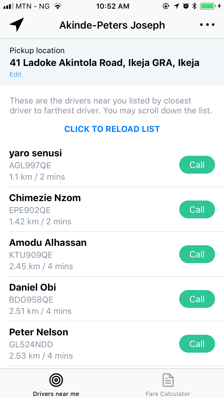
So after the stand up, I fired up Xcode and got ready for another love-hate experience. I began tinkering with the codebase by adding a contçainer view as a buffer between my tab controller and the navigation controller (because I wanted consistency between both tabs) and a new UI component that shows your current pickup location with the ability to edit it.
 |
 |
|---|---|
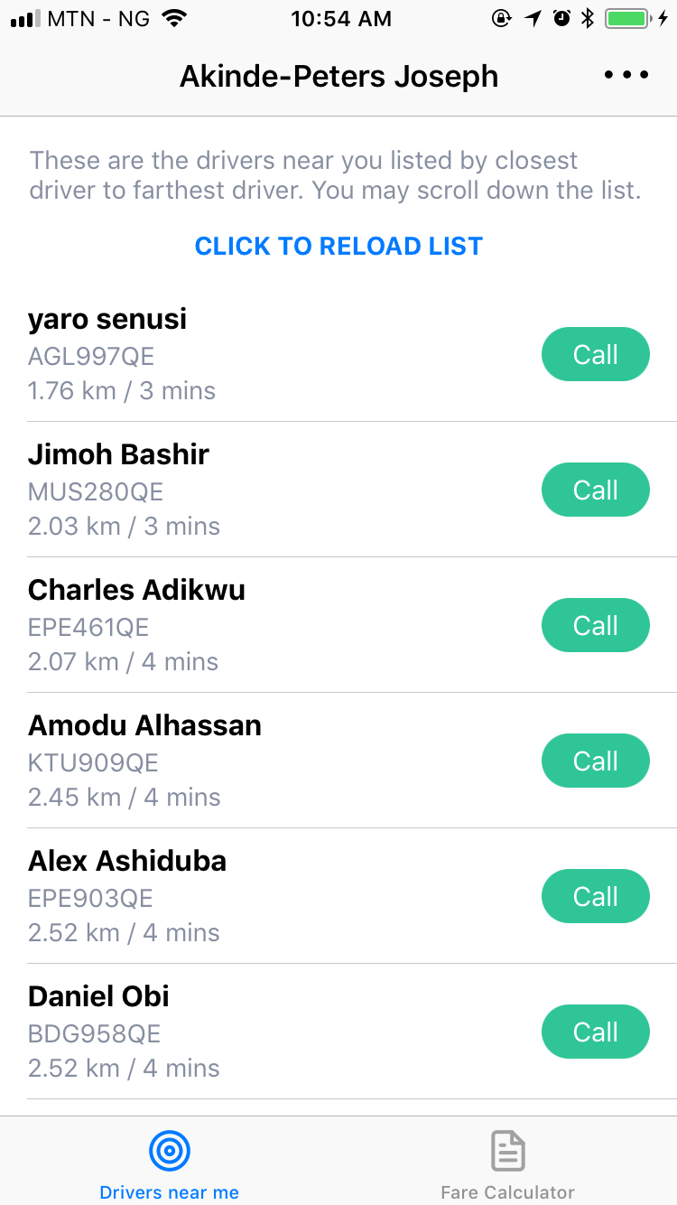
| Before | After |
You’d think all is well, right? I thought so too. But the beauty of User Acceptance Testing came through as it became (quite alarmingly) obvious that a significant amount of users didn’t know what the the new icon at the top left of the navigation bar meant. Some even said they didn’t see it 😱. So it became my onus to delibrately introduce the icon to the users.
Welcome Feature Highlight
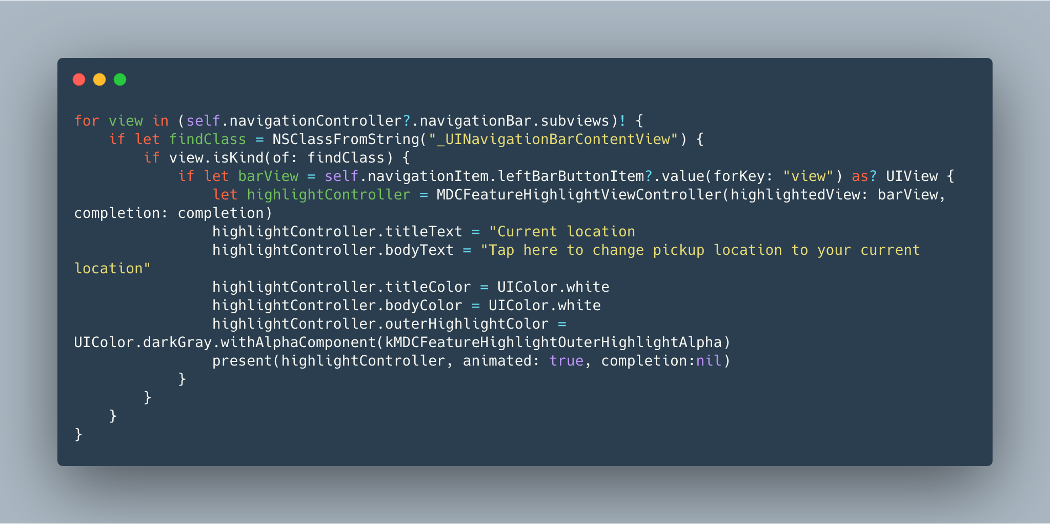
With a few lines of code, you are all set to add an highlight to a new feature tied to a UIView. However if you intend to highlight something different like a UIBarButtonItem as it was in my case, you have to do more digging into the subviews and check if a particular view is of a certain class kind before you can highlight the button item — this is because the UIBarButtonItem inherits from UIBarItem and not UIView.
So how exactly did I get mine done? I’m glad you asked, here you go…

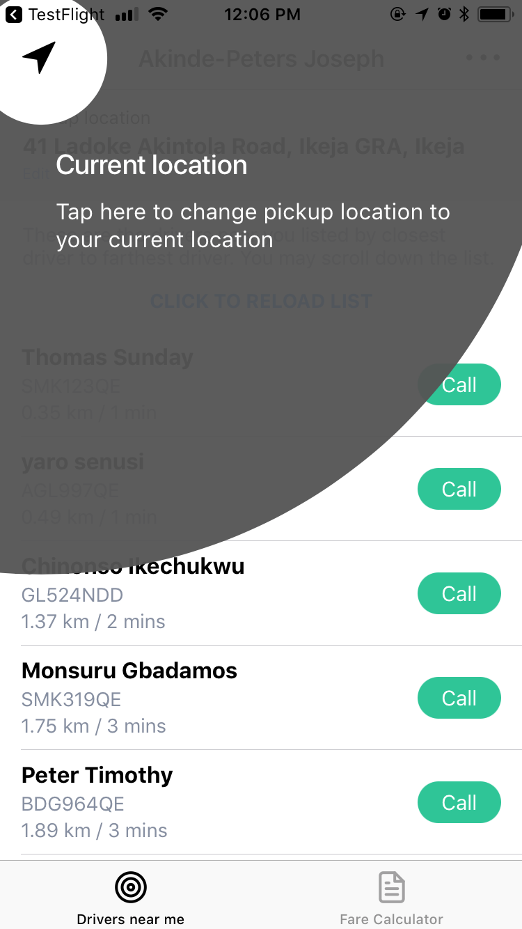
Adding that code snippet to the viewDidAppear method resulted in this.

Voila! 🎉
Got any questions or suggestions? Feel free to reach out or connect with me.
The end.